Client redesign of a fundraising platform in Figma: rebuilding navigation, user flow & the full campaign-creation experience.
Figma
Redesign
Non-profit
Custom 404

_OVERVIEW
Dare to accept is a fundraising platform with three paths: take a challenge, ask for help, or attract sponsors. Designed solo in Figma from a half-built site, a homepage, and half an about page, no forms, no profile page. The goal was to design the website and make three confusing paths clear, transparent, and intuitive for users.
09.2025
Product,UX/UI designer
Freelance client work


_Problem
Dare to accept bundles of three products in one:
Take on a challenge;
Ask for direct help;
Build a profile to find sponsors.
The site I inherited was a homepage, an About page, no clear navigation, no profile or form, and no way actually to create a campaign. A first-time visitor landed on it and couldn't tell whether the site wanted them to compete, donate, or get sponsored.
_Approach
Before starting any design, I studied how the platforms that work in this space guide a first-time visitor. I researched websites like GoFundMe, JustGiving, Kickstarter, GoGetFunding. I started with a design system, one type scale, a green brand ramp, components, to keep the design consistent across 30+ screens; without that foundation, consistency would be impossible and iteration would have crawled.
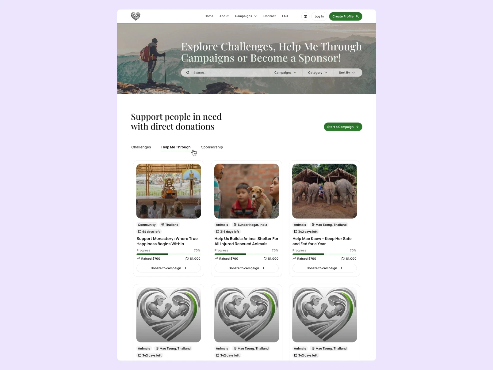
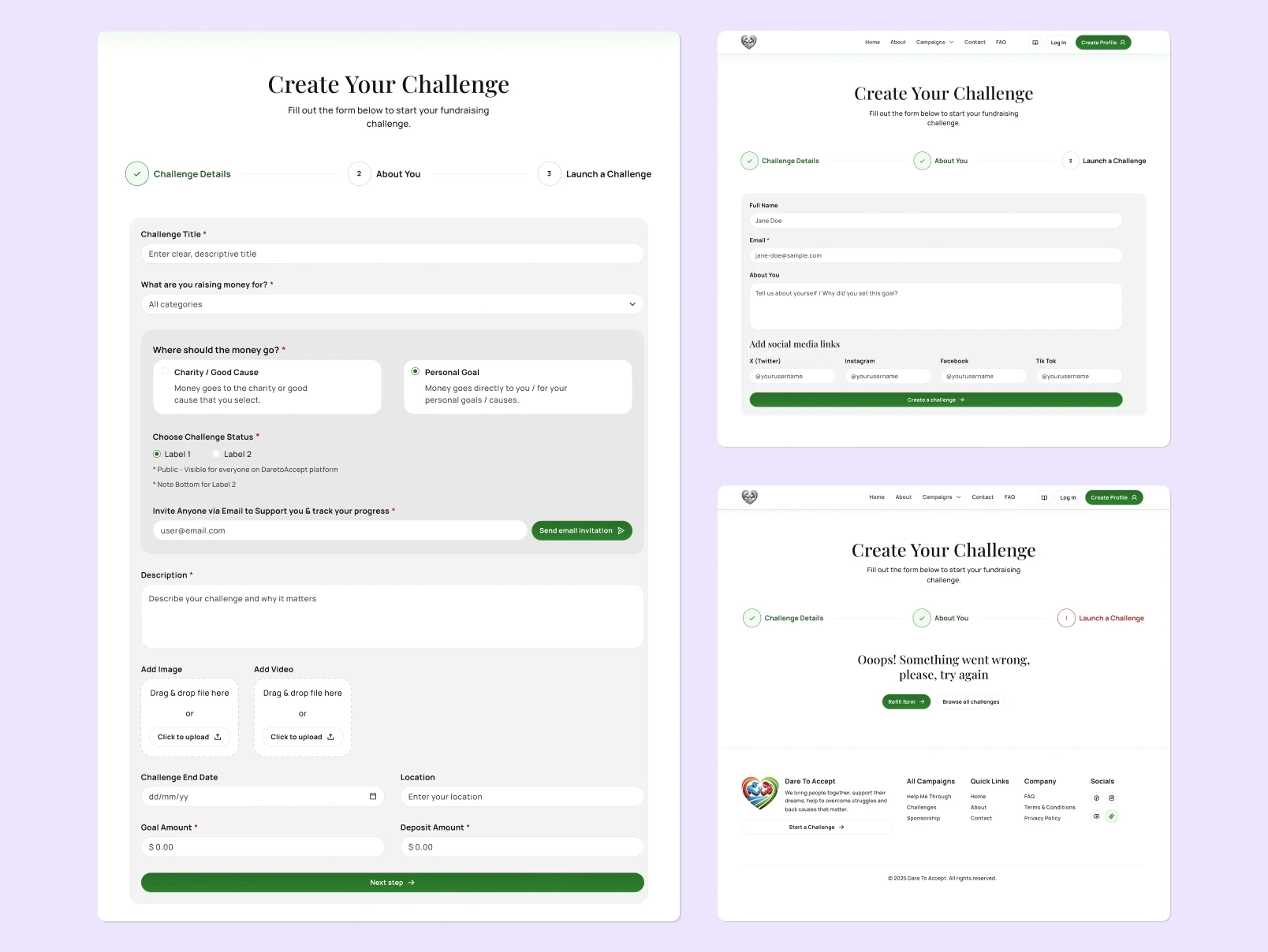
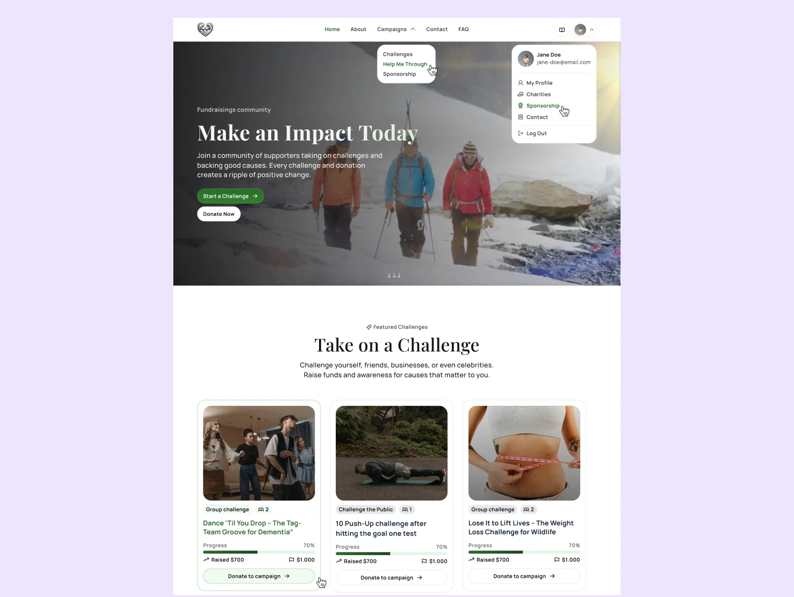
Instead of three separate products, everything lives under one Campaigns page with tabs navigation, the cards grid stays identical across all three paths, so learning one of them, user knows the others. I designed the empty - fallback state, success & error states. This isn't optional design polish: it maps directly to Nielsen's first and ninth usability heuristics, visibility of system status, and helping users recognise and recover from errors. I split the Create Campaign form into three clear steps with a progress stepper, so the process to fill the forms or create your own campaign feels trustworthy & smooth.
_Results
Dare to accept was my first end-to-end product design project. It helped me a lot to my sharper Figma skills, Product & UI/UX design skills and brought real engagement across profiles on platforms like Dribbble, Behance, LinkedIn, X - the Contact Page shot becomes my most-viewed shot & liked shot on Dribbble.
*The project did not go live due to the development reasons not connected to the design parts.

